


azure68
-
Posts
48 -
Joined
-
Last visited
Content Type
Profiles
Articles
Media Demo
Forums
Gallery
Events
Store
Blogs
Downloads
Posts posted by azure68
-
-
Best to contact the supplier to find out. SFIC is fine for about 2 - 3 years. I've gotten a base from Snowdrift Farm a while back and after a year, it turned tan on me.
-
Another 5 percenter over here.
-
I've been using them exclusively and I absolutely love them for CP. I haven't done any MP for a while and I usually don't color my lotions, creams, or scrubs, so I won't be able to help on that part. Printing out their shade guides are a big help. What's nice about the guides is that they even have one for high olive oil content soaps to account for the color shift.
-
Are you sure that's your first?! Congratulations! I think it looks great! Now you'll be on the constant mission of finding the "perfect" recipe and will be obsessing on when your next batch will be.
-
-
My sentiments are pretty much what Donna said. Whenever I create any type of design work for a client, I listen to what their needs are. I don't try to force them into something that they won't be happy with. I can offer suggestions on what will or will not work, but it's ultimately their final say on things. I make as many edits as needed because ideas need to be honed, and that doesn't always happen on the first round (but when does it ever?). However, there are a few occasions when clients will totally give me creative freedom and I usually hit the one they want in the first draft.
-
I've used their unrefined shea. Great stuff. And their service is excellent!
-
Thanks, it's my "new" favorite scent.
-
They look so nice.

-
I made these a few nights ago. This is scented with lychee.

Thanks for looking.
-
Wow, Carol! Those look great!
-
I am a graphic artist. I do logos (L), labels (LB), any type of corporate identity (business cards, stationery), postcards, brochures, marketing pieces, photo editing and retouching.
I also do some web design as well. I can email samples upon request.
-
Your logo looks good in black and white, which also means it's a good design. You know that it will fax well, and if you ever need to make a stamp out of it, the design will be a good one. If you ever get to that point, I suggest that you get rid of the little horizontal lines in the tree trunk, since I don't think that will show up in the stamp.
I would get rid of the rectangle though. I think that will open it up more and won't feel as confined. I would just color the tree a different solid color. If you want to do monochrome, you can take a base color and then do color percentages of it. If you get these professionally printed, it will save you $$$, because it's still technically a one color job that they're doing.
-
I do about 2 4-lb batches a week. I am totally small time. I have 2 3 lb log molds that someone gave me from Sweet Prairie. However, I also have my eye on the 16 Bar Misty Creeks. I just love their soap cutter. I might get 2 of the 16 Bar molds instead of the 32 Bar mold.
-
I use low profile jars that I get from bayousome.com. If you put a preservative in your FBB, I don't think nasties growing in there should be a problem. I've never had a problem before.
-
I would use the 1" height.
Summerbee Meadow has a calculator that will help you figure out a batch according to your mold dimensions.
-
My first batch of CP was made in a Rubbermaid drawer organizer. I used the larger rectangular one and used 2 lbs. of oils. I lined with freezer paper, but was a PITA because of the slightly slanted sides of the drawer organizer.
-
I've used BB's stabilizer with much success. I used SC's Pink Sugar with it and my soap has not changed color. I have a MP bar that I made a year ago, white, marbled with pink and it has not discolored at all.
-
I've been plugging in various percentages of oils I have in soapcalc until I come up with numbers that I'm happy with. Most important thing to me is conditioning. When I come up with a number I'm happy with, then I start tweaking with hardness and lather. Of course, the type of additives can also affect your final outcome. My last batch, I used a can of coconut milk for my liquids, so I'm pretty sure that should add more creaminess to the soap.
-
Those are very pretty!
-
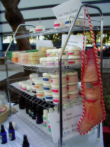
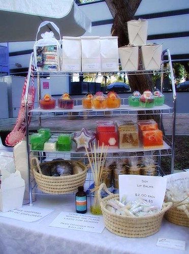
You have very nice looking products. I just love the baskets. When I display my MP bars, I usually put the label at the back, so that it won't cover the pretty designs and colors of MP soaps. Instead of using Saran Wrap, I use the Sam's Choice cling wrap from Walmart. It gives a really nice stretch and it's permeable enough for the scent to come through, and it's cheaper than Saran Wrap. I agree with others about elevating your bottles. Customers are drawn to height. If you can find a way to elevate them, that would make your products stand out even more.
Here are a couple of pictures I took at my table last year. Please excuse the look of the displays. I was under a tight budget at the time, so I had to improvise:
-
For my first time doing CP, I used 12.% cocoa butter and 12.5% shea. The batch recipe also had olive oil and coconut oil in it. I reached medium trace within 2 minutes with the stick blender. I scented it with Dutch Chocolate FO and swirled with cocoa and gold micas. It cured to a very hard bar, feels nice and smells so good.
This was how it looked after it was freshly cut:
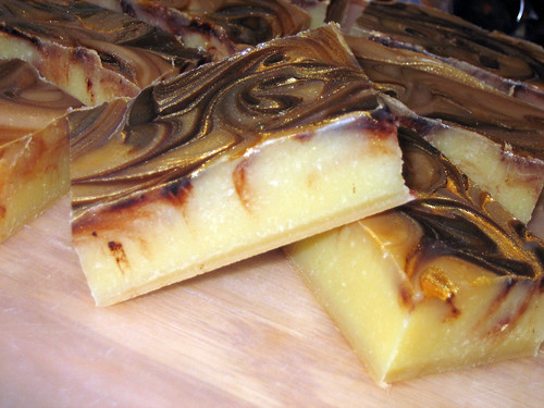
It has since darkened considerably because of the fragrance oil.
using wood mold for first time , question
in General Soap Making
Posted
You can line it with a trash bag.