


dwarfie
-
Posts
83 -
Joined
-
Last visited
Content Type
Profiles
Articles
Media Demo
Forums
Gallery
Events
Store
Blogs
Downloads
Posts posted by dwarfie
-
-
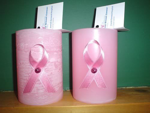
ok you guys were so right about the hang tags. tell me what you think.
-
nice labels and i LOVE the jars!
-
very nice!! great idea too!
-
ooooooh very pretty!!!
-
stunning as usual!!
i'm jealous of your rustic skills

-
that is so cute!!
-
very nice!
-
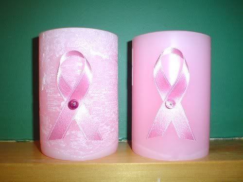
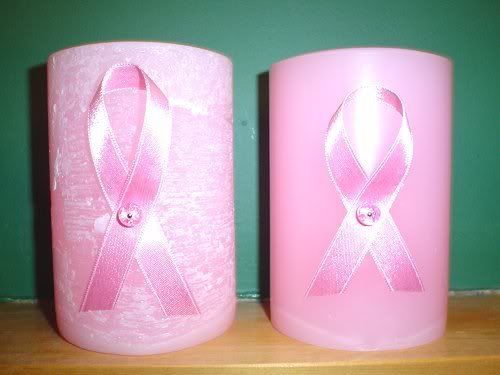
ok how about these? i cut the ribbon to the same size on the smooth one so now they're both the same and i changed 1 candle to a darker bead:
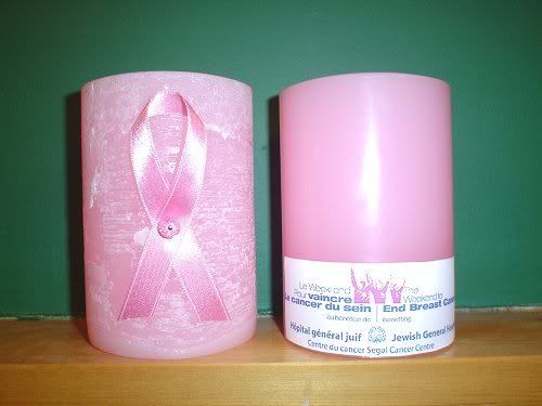
i tried doing a few different labels for the logo. the top is the same as before. the bottom one is printed on a clear label. the middle one is also a clear label however i made it in a pink background.
i'm still undecided on the logo. i might just put it on the bottom or make some kind of hangtag.
-
OMG!! sorry that came out sooooo big!!!
-
thanks for the input everyone!!
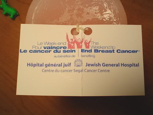
Lin - the hang tag is a great idea!! now i just gotta figure out where to put it so it doesn't take away from the look of the candle. i suppose i could always just put the logo on the bottom of the candle too.
Candleman - last year when i got the idea to make candles for breast cancer i came up with these:
i'm just fed up of doing white and i really love doing pink now. i'm also going to make some with darker beads so that will make the ribbon stand out more too.
-
thanks everyone!
Mozzie - i have tried using decal paper before and it never turned out nice and then it just peeled right off.
-
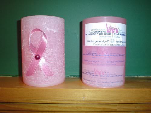
in August i will be walking 60 km in 2 days for breast cancer.
i decided to make some candles to sell for $15 and donate $5 of that to the hospital that is organizing the walk. i also need to raise $2,000 in order to do the walk so i'm hoping the candles will help me get to my goal.
i decided to make 2 kinds, one smooth and one rustic (i love the rustic!)
let me know what you think. are they too plain? what about the logo on the back - how can i make that look better?
-
i absolutely LOVE your rustics!!!
-
very pretty!!
-
great job!! i can almost taste it

-
very very nice!!!
-
beautiful!!!
and i just LOVE your labels
-
i LOVE LOVE LOVE them!!! just gorgeous!!
is it a long process to make one? I want to try these and have no idea how to do them.
-
I live in Montreal and order all my supplies from Canwax. They have great service!!
-
i just have to tell you again how much i love those!!! please tell me how you did them.
-
those are beautiful!!
-
i love that colour. your candles are very pretty!!
-
thanks Diana. he didn't take long at all. i did the balls overnight and then the next day whipped up the wax and maybe in 1/2 hour he was all done. i even made his scarf.
-


Forever Palm
in Old Style Candle Gallery
Posted
very pretty. can i have it?