


kate
-
Posts
96 -
Joined
-
Last visited
Content Type
Profiles
Articles
Media Demo
Forums
Gallery
Events
Store
Blogs
Downloads
Posts posted by kate
-
-
I love you site - very professional looking!
-
Thanks for the suggestion, I'll give that a try - when I realized I had forgotten the weight in the shuffle, I just kinda slapped it on there, I really didn't know where the heck to put it.
Thanks for your help and suggestions!

-
I did change it around a little since I posted ... here's the update, and I'm sure I'll change it some more! I'm never, ever satisfied with my labels....

This one was sized for a my 4 oz malibus, so it's 1.5" x 3.6." I'm also using an 8oz bullet bottle, so for that I'll be able to stretch it out much more, and I think it will look better.
Right now I'm thinking of doing the cutout door on the malibus, it just fits better with the curve of the top of the bottle, and using this one for my bullets. Then again, I'm wary of using two label styles ... decisions, decisions! I'm sure I'll get some feedback at the first show I do with these, most people have no problem telling me what they think!
Edited to add:
Holy crap, what was I thinking with those keyholes? LOL! Looking back, I'm quite embarrassed that I even posted them! The concept in my mind was much better ... really it was...
-
Thank you all so much for your input. I printed the last two labels that I posted (the plain door and the one with the half cutout) and put them on my bottles - they look different printed than they do on the screen - and I'm undecided about which one I like. I took them to work and my coworkers are split 50/50 about which one is better. As one coworker put it, the door cutout is more attention grabbing, while the plain door is more understated and elegant. So, I'm still at a loss, lol.
-
I have no room to talk because I’m having my own label conundrum, but I'm going to be in the minority too – I love the marble look of the label, but I don’t think it goes with the “country” jars. Between the square and round, I do like the round ones better.
-
Okay now, see, I LOVE LOVE LOVE that! I think that is beautiful!
And I don't want to be just a negative harbinger of doom or anything, but I actually prefer the ingredients on a back label - I do two labels, one for the front with just the name, details, and ingredients and directions on the back. I prefer that look, because it's much cleaner and simpler, and it seems that it would go with your image.
If you choose to keep the ingredients on the front, I still love it, it's beautiful!
Thank you!
I was going to do the ingredients on the back, but way up above in a post sockmonkey recommended just one label - less hassle and lower cost. So since I'm just getting started with the B&B I'm going to do one label for now. I would prefer to have the ingredients on the back, so if it goes well, I may redesign.

-
That's a really neat idea, and that frog is just too cute!
My SIL is a frog fanatic, I may have to do something like this for her. She's having a baby and the whole nursery is going to be frogs.
-
Thanks everyone for looking at my labels and offering advice. I think this is the final version - I'll probably play with the font colors a little, but the basic idea will work. I really like the cutout door I posted above, but I think it's too hard to read unless you're up really close.
Darn it, as soon as I posted I realized the net weight got left off in the shuffling of fonts. I have no idea where that's going to go. Does anyone see anything else missing?

-
Well, see, now I'm not feelin' the keyhole, now that it's a shorter, fatter keyhole, I don't think I would recognize it as such right off the bat. I'm not a big fan.
Do you really need the keyhole? I like just the simplicity of the beautiful, deep orange door.
Funny you should say that ... this is the latest.

The black looks a little hard to read on the screen, but it looks good printed. Now that I've played with the fonts a little, I may revisit the plain door as well. I tried it originally and didn't like it, that's when the keyhole idea came in.
-
Ready for round 2? Here's the tweak with the smaller keyhole. I angled the bottom by mistake, but then I kinda liked how it looked.
Of course I just saw your post about putting the ingredients on the front - I may try that. It's a very good suggestion, anywhere I can cut costs is good!

Again, any suggestion anyone has to offer is welcome. Please don't worry about hurting my feelings, I'm in desperate need of help!

Edited to add label with ingredients.

-
I agree that the keyhole is too large, and I think it creates too much white space and covers up too much of the door. Here is what I would try...
1. Reduce the keyhole to about half the size it is.
2. Print Orange Door Candle Co. as curved text around the outer edge of the circle part of the keyhole.
3. Leave Vanilla Buttercream as it is.
4. Print goat's milk & honey lotion across the bottom panel of the door in white or black ink, and maybe bold it.
Now a question: Where are you listing your ingredients?
First, a HUGE thank you to everyone who has commented.
Sockmonkey, I like your suggestions, I'm going to give that a try and see how it looks.
I'm going to have a label on the back with ingredients and company info. I thought if the front label was unique enough, I wouldn't need the company name on the front, just the back. That's why some of the labels don't have the name.
BizzyBs, I like what you said about the unique name, I want to do something really cool with the labels, I just don't know how! LOL
-
Spellkast-
I didn't take anything you said as being mean - that's why I put them up here, I just didn't feel like I was getting it right. I thought if I put all of them, maybe someone else would be struck with inspiration and tell me what the heck I was doing wrong!
I did have a thread before - that was for my candle labels and they are hangtags. Since these are going on bottles, I was trying to utilize the length of the door. When I get home tonight maybe I'll try without the keyhole. I wanted to just do a keyhole, but they would be a PITA to cut out!
-
... of my B&B labels. This particular one is for my lotion - which I'm not quite ready to sell, I have about 5 people testing for me right now. I just can't stand having the labeling issue hanging over my head.
I know I'm throwing a lot of images up here - I think I'm at the point where my brain is so fried, I just don't have a clue what is good and what isn't. So what do y'all think - do you like any of these? Should I go back to square 1?
I have SUCH a hard time with this. I see labels that look so awesome, but when it comes time to create my own I just can't seem to get them right. Please feel free to be honest, that's what I'm looking for!
Thanks so much for looking!
Kate
By the way, my company name is "Orange Door Candle Co." hence all the door pics.
1.

2.

3.

4.

5.

Hmmm, is it goat's milk or goat milk? I seem to have it both ways, I just noticed.
-
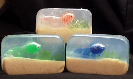
I do these and I use the Oatmeal M&P from WSP - it looks exactly like sand without adding anything to it.
Kate
Edited to add pic (These are some of the first ones I ever did, so they're not great, but you can see what the "sand" looks like using the oatmeal base)
-
Darn Terrie, you had to chime in! LOL I was set on Millcreek, but perhaps I should just order a sample from both. Anyone else have an opinion?
I do appreciate all the help!!
-
Thanks everyone for your input - it looks like I need to give Millcreek a shot. Now off to do a search of other FOs I should get from them ... might as well make the shipping worth while!
-
I'm working on my B&B line and I had a customer request that I add Winter Candy Apple (BBW) lotion. Does anyone know of a good dupe? I found some listed at Nature's Garden and Mill Creek, does anyone have an opinion of either of these? Or another source?
I get most of my FOs from Peak and BCN, but I didn't see anything listed at either place, unless I missed it.
Thanks!
Kate
-
I read this with interest because I've been trying all different kinds of colorants for my M&P. I thought maybe I would try the Lab Colors so I went to the links mentioned. And now I need some serious help - I've been looking and looking at these, and I keep going to different online converters, but I think I must be doing something wrong. Here are the two links I'm looking at:
http://www.chemistrystore.com/soapcolors.htm
http://www.brambleberry.com/basic12.html
At the Chemistry store, you can get a set of all 12 colors - 1 oz. each - for $17.96 (which they are advertising as 25% off, originally $23.95.)
At Brambleberry, you can get a set of all 12 colors - 10 ml each - for $62.79.
From what I'm seeing 1 oz = 30 ml, so that makes the price difference even greater. What am I missing?
Ok, now that I typed all this in, I don't see on the Chemistry Store site where it says they are Lab Colors - it just says soap colors. Are the Lab Colors that much better? Anyone have either of these and care to shed some light on the huge price difference for me (or just tell me I'm nuts and can't do my conversions right :whistle: )
Thanks for helping a very confused soaper!
Kate
-
Thanks everyone for your replies. I figured it was just the scent - I have trouble with vanilla and a few others as well - but it never hurts to see what everyone else is experiencing. I was hoping it was the beads, that would have been an easy fix!
-
I make ornies with the aroma beads from BCN. I use 1 oz FO to 3 oz beads for the most part, sometimes less FO if it is a strong scent. My problem is some scents just refuse to completely absorb into the beads no matter how much I shake or how many additional beads I add (I've tried up to another 2 oz beads) - it takes a month for my sugar cookie to absorb enough to make ornies, and even then the beads are still a bit wet.
Has anyone else had this problem? Should I try a different supplier for my beads or are they all the same?
Thanks!
Kate
-
Thanks for all the replys - looks like I'll be ordering a few samples!
-
Anyone have a favorite supplier for CLV? I'm looking for a dead-on dupe of BBW to use in M&P and lotion.
Thanks!
Kate
-
I was wondering the same thing....
I got all excited when I read about the 6228 also. I thought oh good they must of brought it back and I missed it. I went looking and I can't find it. So I was wondering if these people just had left over from when candlewic still sold it? I love the 6228 also.
Oh, and my world comes crashing down! LOL. I was one of the people who said they get the 6228 from Candlewic. What I have is left from when it was on clearance - I REALLY stocked up and forgot that I can't get it anymore. From what I understand, the CBL-141 replaced the 6228.
-
I just want to add another positive experience - I've been getting all my wax from Candlewic for years, and I just love it. I agree with Top, you just can't go wrong with the 4045 and I also use the 6228. The last time I placed an order I talked to them about wanting to try container wax and they sent me about 10lbs. of different waxes free to try. I know that many companies will do that, but since CS is at issue, I just wanted to note that they were very helpful and willing to work with me to find something I'll like.
And as has been mentioned, you just can't find a better wick selection, I can't imagine ordering wicks from anyone else.
I've never had a problem with my shipping, so I haven't had to deal with the problems that some of you have had, but any time I have called the rep I've spoken to has been helpful.
Just wanted to add my 2 cents.
Kate


aroma beads ???
in General Candle Making Discussions
Posted
I can't help with the coconut bay, but my experience with vanilla has been very frustrating. I have beads that I started in January that still have not soaked up all the vanilla FO. I've tried adding more beads, I've tried putting them in a barely warm oven as someone on the board suggested, but nothing seems to work. I've pretty much just given up on the vanilla ... sorry I guess that wasn't actually a helpful answer. Hopefully someone will come along who
can help you!
By the way, I used the Bittercreek directions too, and I have 10 scents that I like that will soak up anywhere from a day to 4 days consistently - it's just trial and error to find out which ones will work.